
Contents

How Show Ratings Pie Chart Works
| Applies to: | ||
|---|---|---|
| ✔ Dynamic |
✔ Client Portal |
|
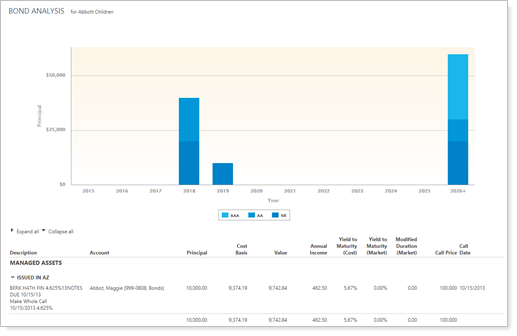
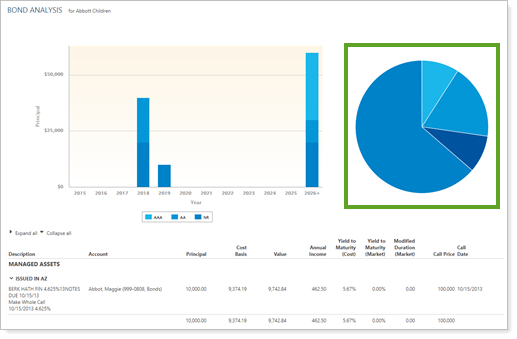
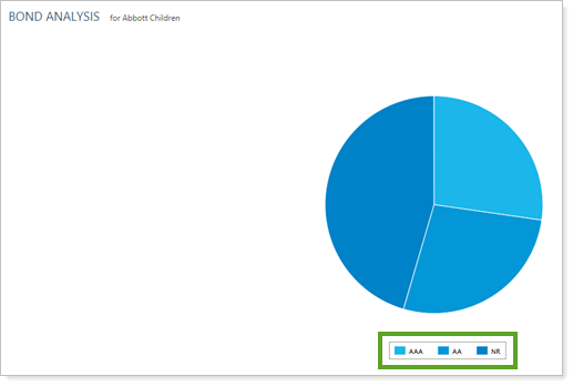
This setting allows you to choose whether to show or hide a pie chart that reflects the proportions of each rating appearing in the total bond portfolio, and lets you control some customizable features of the chart.
You might choose to display a ratings pie chart with your Bond Analysis report for an at-a-glance visualization of the ratings within a portfolio.

In Dynamic Reports
| Setting | More Information |
|---|---|
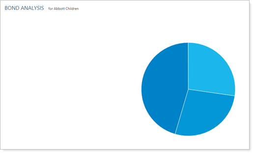
| Show ratings pie chart cleared |
|
| Show ratings pie chart selected |
|
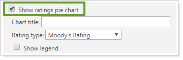
When you select the Show ratings pie chart check box on the Bond Analysis report, the following settings appear.
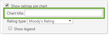
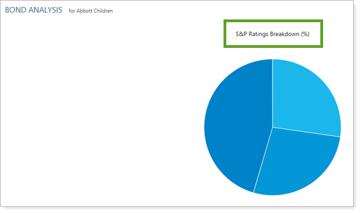
Pie Chart title
This setting lets you add a custom title or no title above the pie chart.
| Setting | More Information |
|---|---|
| Chart title field left blank |
|
| Chart title field set to S&P Ratings Breakdown (%) |
|
Rating type
This setting allows you to determine which agency the ratings data comes from.
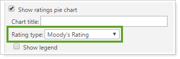
Rating agencies available for display are:
-
S&P
-
Moody's
-
Fitch
Note
If you select Moody's Rating or Fitch Rating, the chart will use S&P-style ratings (AAA, BBB, etc.), but the percentages will accurately reflect Moody's Rating or Fitch Rating for the equivalent categories. See the Bond Analysis report for details of how different ratings agencies' ratings are displayed in Advisor View.
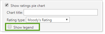
Show legend
This setting lets you show or hide a legend for the pie chart.
| Setting | More Information |
|---|---|
| Show legend cleared |
|
| Show legend selected |
|
In PDF Reports
Functionality is the same in the PDF report templates as in dynamic reports. The full PDF report and the PDF dashboard both offer the following additional settings:
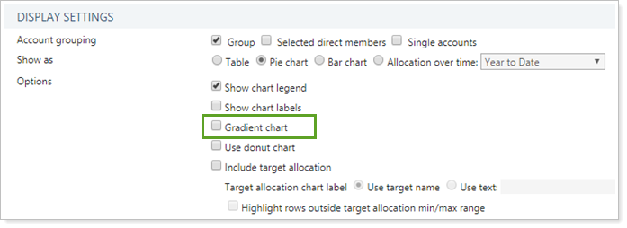
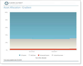
Gradient Chart
In PDF reports, you have the option to add a gradient to the chart. The look of each chart depends on the PDF template theme.
-
To display charts with standard formatting, clear the Gradient chart check box.
-
To display charts with a gradient, select the Gradient chart check box.
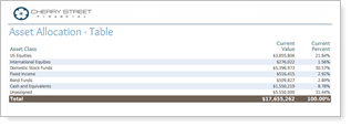
| Type | Gradient Chart Cleared | Gradient Chart Selected |
|---|---|---|
| Table |
|
No change. |
| Pie |
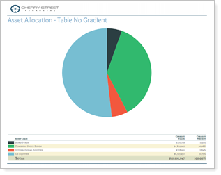
|
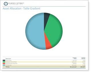
|
| Bar |
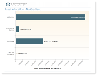
|
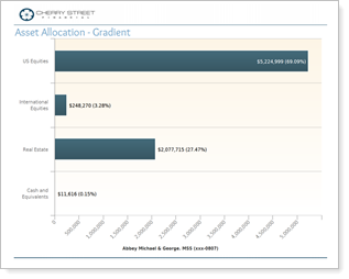
|
| Allocation over Time |
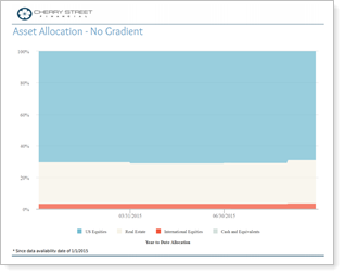
|
|
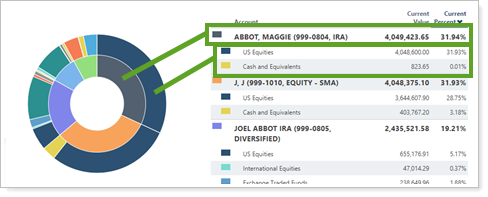
Use Donut Chart
This setting changes the look of the chart from a traditional pie chart to a donut chart.
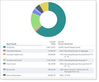
When you Group by/then by, the donut chart includes both grouping levels. For example, if you group by Account and then by Asset Class, the donut chart displays accounts on the inside and asset classes in each account on the outside.
Reports With This Setting
Holdings Reports
|
|
Related Settings
The following setting is related: